Problem Introduction
Problem
UI Health and OSF Innovation are hosting an eye screening for unhoused Chicagoans. They wanted an educational deliverable that patients could autonomously go through.
Audience
Unhoused Chicagoans and recent asylum seekers, aged 40 years and above (Chicago Point-in-Time Count 2023).
Project Limitations
-
Unable to test and work with audience
-
Limited research-based data on audience
-
Relying on committee feedback as user testing
-
Team of one!
Research-guided solution
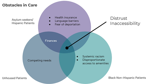
Main obstacles in healthcare
-
Distrust in healthcare
-
Inaccessibility of information and services
-
High reading level in medical copy
-
Competing needs
Solution
Average reading level of 8th grade
Comprehensive list of resources in one space
-
All elements within WCAG standards
-
Digital and print deliverable to expand access
Sketches and copy development
The design stage began with several wireframe sketches. This allowed for quick ideation and experimentation with different layouts.
Copy was then developed and ran through WebFX's reading level checker to ensure it was below an 8th grade reading level.

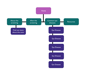
High Fidelity Wireframes
With the copy finished, high fidelity wireframes were then created in Figma to plan how the copy would be laid out with planned visuals.
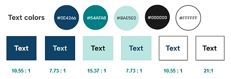
A style guide and small design system was then created. All colors were ran through a contrast checker to ensure they passed minimum WCAG requirements of 4.5:1.

Product Development and Testing
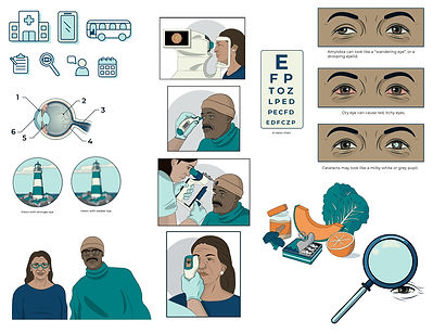
With a design system and color scheme created, the last step of production was to produce the assets. Illustrations were completed in Adobe Illustrator and photographs to represent symptoms were completed in Photoshop.
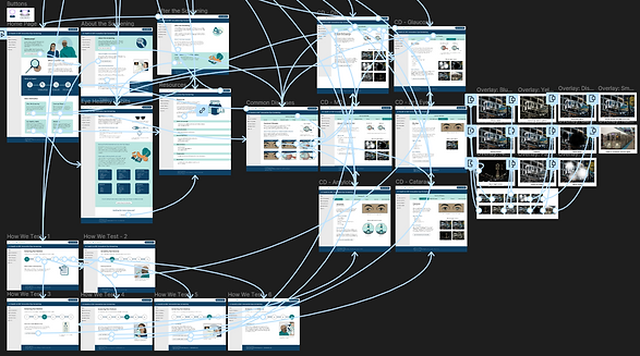
Once integrated, all frames and components were then prototyped through Figma.
After prototyping was completed, the corresponding brochures were then designed and connected to the prototype.
Results
To evaluate the prototype's success, it went through four evaluations: a reading checker, a contrast checker, a quantitative survey based on Morville's Honeycomb theory, and a qualitative discussion with the research committee.
Though the prototype passed quantitatively, the qualitative discussion found that there was much room for opportunity. All comments were tagged and categorized through Notion with the main comments pertaining to addressing the audience, the readability of the text, and general design comments.

.png)
